Sunday, August 24, 2014

Road Trip Part 2: The Clark, Williamstown, Massachusetts

Continuing from Part I - repeating the paragraph from the end of that post:

Make It New: Abstract Painting From The National Gallery of Art, 1950-1975
Before showing you my amateur iPhone pictures, I recommend that for professional views you take a look at some links: the Clark's Facebook images of the show and also a review by Cate McQuaid in the Boston Globe with beautiful pictures.

So we are in the first gallery of the show that consists of 35 paintings curated from the National Gallery's collection by its curator, Harry Cooper.


Viewers in front of Jackson Pollock painting, Number 1, 1950,  (Lilac Mist).

Detail of "Lilac Mist" surface

When you enter the gallery, you are facing Pollock's painting. Other works in this gallery are by Pollock's contemporaries - Rothko, Newman, Kline, Still and Joan Mitchell. The Mitchell work faces the Pollock.


Joan Mitchell, "Piano mechanique," 1958, oil on canvas, with two details.

I was excited to see this work because I had only seen Mitchell's later work in person. As her work progressed, it became much more fluid and less what Cate McQuaid calls "effortful." Still, the number and variety of marks she makes plus the amount of color grounded by black in this work, make it much more interesting to me than the Pollock. And she's a woman painter among all those guys, making me pleased to see her confronting Pollock.


The Color Field Painting Gallery


Color Field Painting 
I've never been that interested in the stained form of color field painting, and I thought the most interesting work in this gallery was the one by Larry Zox, you can see it on the left wall of this gallery in the image above.


Larry Zox, "Decorah (Single Gemini Series), 1968, acrylic on canvas

Zox's work looks very contemporary. It  conveys the interesting illusion of folding in at the center when you stand in front of it because of the triangles pressing in from all sides.


Daniel Buren, "white acrylic paint on white and blue striped cloth," 1970.

The small corner work by Buren was also unexpectedly contemporary, from its placement, to its raw edges to its installation with push pins. (I'm not sure that it was in the Color Field gallery, but I'm putting it here to relate to the Zox work.)

Pattern, Texture, Shape and Other Categories
Probably to make the work more accessible, paintings were sorted in this show by technique or prominent feature. However, as I look back on my photos, I can make no sense of where one began and the other left off because I don't agree with the distinctions. So I'm just going to put works together as they make sense to me.

The highlight of one gallery ("Pattern", "Shapes"?) to me was the work by Al Loving. He seemed like an old friend because I had presented his work in my talk on bricolage at the Encaustic Conference last June. Since my image was not very good, the one below is from Cate McQuaid's review in the Boston Globe.


Al Loving, "Brownie, Sunny, Dave & Al," 1972.  ESTATE OF AL LOVING, COURTESY GARTH GREENAN GALLERY

Frank Stella, "Delta," 1958, enamel on canvas

Frank Stella's piece made an interesting complementary to the Loving work. I had never seen this work in person and didn't realize that it had such a shiny, gooey look that I think adds to it and relates it more to Ab-Ex.

Marcel Broodthaers, "Panneau de Moules (Panel of Mussels),
 1966, mussel shells, resin and paint on panel

Another bricolage work, that drew everyone to it to see if was really shells on panel, was this great piece that has such wonderful texture. My photo is lousy but you can see the shadow below of the ragged forms.


Yayoi Kusama, "Infinity Nets Yellow," 1960, oil on canvas

This is just one section of Kusama's very large painting this consists of yellow circles painted on a dark ground. There is relatively little texture but the obsessive pattern is mesmerizing.

Of course I am leaving out many very well known works from the show, but I am just choosing my favorites and  Lee Bontecou is right up there at the top of my list.


Lee Bontecou, Untitled, 1962, welded iron, canvas, wire and black paint

I love being able to see the stains, marks of wear, and patches on the worn canvas she used along with the tiny copper wires holding the canvas onto the welded iron. The photo doesn't show it, but when I looked into that gaping black hole of eternity, I could see a little light at the seam.


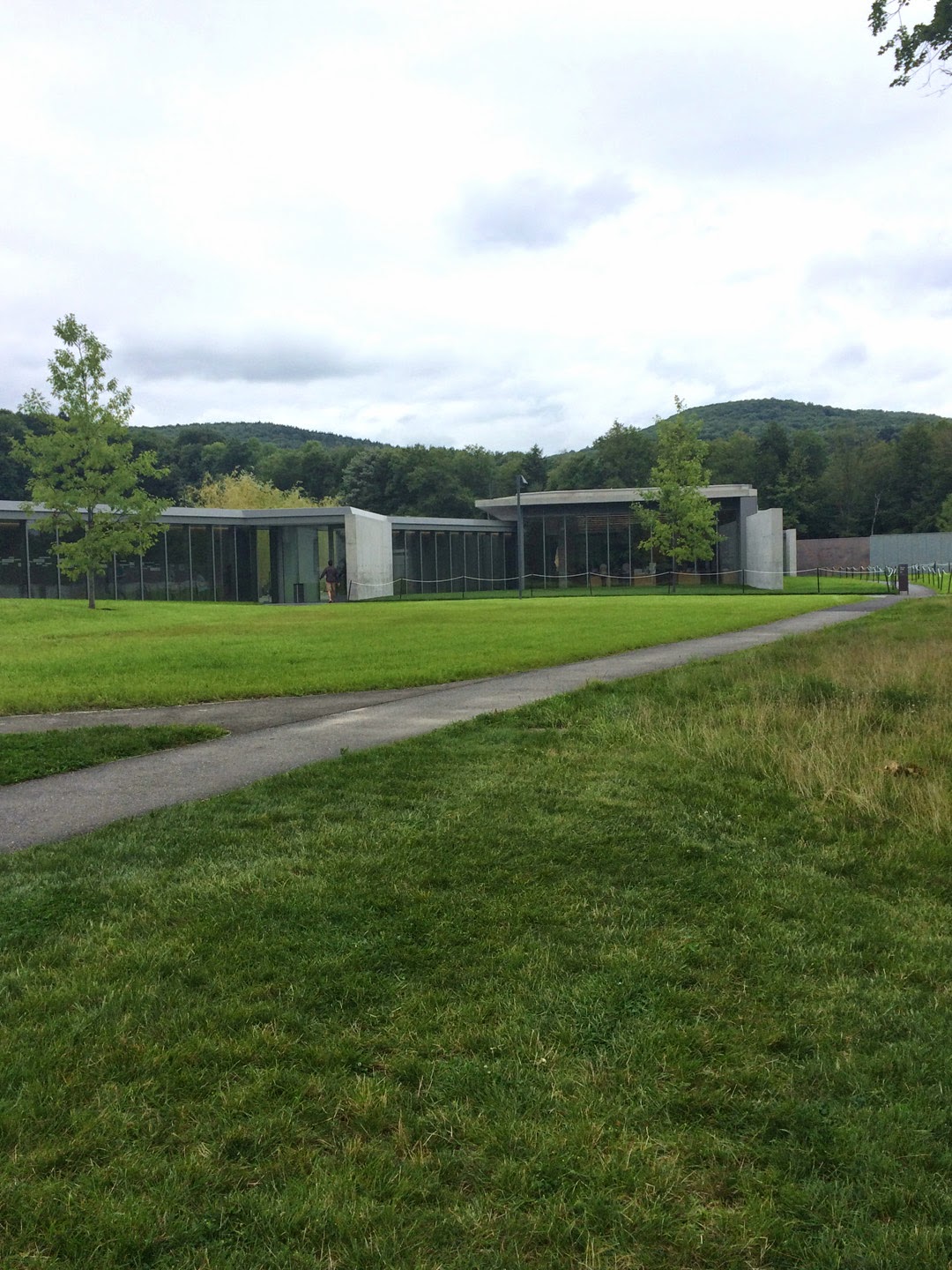
Emerging to Nature, Restricted

Paved terrace with reflecting pool and willows

Terrace with reflecting pool and roped-off grass.

Gee, doesn't that grass look inviting? Well, forget about it!


I think this is the real front door. We saw it on our way out.

A hidden corner

A sea of grass being mowed by one guy with a push mower.


Road to the back parking lot


Mind the rope and forget about that grass!
I thought the architecture was clean, crisp and a bit stark. The outdoor areas were lovely but the roped off grass everywhere really spoiled the look of inviting, lush greens contrasted with all the concrete and glass. Perhaps the ropes will be removed when the grass has had a chance to settle in, but somehow I doubt it.


Road Trip, Part 1: The Clark, Williamstown, Massachusetts

Bonnie and I used to take road trips all the time before we adopted our dogs and became more tied to home. We both love riding along and gawking at houses and either imaging how it would be to live there or being thankful that we don't. I've been wanting to see the architectural remaking of The Sterling and Francine Clark Art Institute (otherwise known as "The Clark") since reading about the transformation. So last Friday was the day.

On the Road

Berkshire Hill view, at least I think it's a Berkshire Hill. 

Williamstown, in the Berkshires of western Massachusetts, is a little more than 50 miles away from where we live in Easthampton and it's a scenic trip out there. Although the landscape is still very green and lush, it feels like fall is just around the corner and a few trees were already beginning to turn color.


Curving road on the beautiful grounds of the Clark

The museum addition (by Tadao Ando), gallery renovation (by Selldorf Architects) and landscaping (by Reed Hilderbrand) have been described much better by others, namely Roberta Smith in the New York Times, Sebastian Smee in the Boston Globe, and Lee Rosenbaum in the Wall Street Journal. Mostly, reviewers rave about the changes and improvements, but there's always one (or more) in the crowd who doesn't like change.


The original museum building, as iPhoned Friday.

I found the story of the original Clark, established by Robert Sterling Clark and his wife Francine, a fascinating one: Sterling Clark had piles of money inherited from the Singer Sewing Machine Company, became an adventurer and world traveler who shocked his conservative family by marrying a French actress. The couple's devotion to art collecting and  desire to preserve their collection for the future led to their building the Clark and opening it to the public in 1955. What's not to like?

So, just to let you know that this is just my relation of our road trip and my personal take on the Clark. If you want more, check the links.

The New Building and Layout


I'm showing you these three views because I'm not really sure which one leads to the correct entrance. We went in the wrong door, didn't see an admission desk and were inside for free and walking around the galleries in the original building. Apparently if you take a left instead of a right in the concourse between buildings, you are IN.


This is the concourse. To the left is the original building with American and European galleries.
To the right is the new building with special exhibitions. The plastic "bricks" on the wall honor donors.

The original cornerstone dedication.


The painting here was only postcard size but it contained incredible detail (Lucio Rossi, 1875).

Above are views of some of the European galleries in the original building. They have been revamped to have a cleaner and more spacious feeling. I did notice the difference from earlier visits. And the good thing about the redesign is that you can whiz right through these to get to what you really want to see.


Yes, it's all about the Ladies Room and this one was a real beauty - all that marble tile and beautiful soft light. It was just crying out for a selfie.

Apprehended and Shaken Down
Right after we emerged from the Ladies Room, we went up to a guard to ask where the Abstract Expressionist show was and of course he noticed that we weren't wearing the fluorescent orange wristbands that show you've coughed up your $20.


Passing quickly through the gift shop, we descended the stairs in the new building to pass through
the restaurant and find the Ab-Ex show.


Before descending, however, we took note of the wonderful views through the expansive glass walls.

Make It New: Abstract Painting From The National Gallery of Art, 1950-1975
Before showing you my amateur iPhone pictures, I recommend that for professional views you take a look at some links: the Clark's Facebook images of the show and also a review by Cate McQuaid in the Boston Globe with beautiful pictures.


Cy Twombly in the lobby area, Untitled (Bolsena) from 1969.

I don't want to be a tease, but this post is so long that I'm going to make a Part II with photos of some paintings and my observations. I like posting big images on this blog, but they do take up a lot of space and take some time to load. Plus I have to go watch the Netflix series that I'm bingeing on. First things first.

Sunday, August 17, 2014

Last Week in the Studio: Part 2 - August 17, 2014

In this post, as promised, I show how I got more ruthless.

Last week I made the decision to put aside one painting and make another one (Part 1). In this post I show you how I dramatically changed one painting to go with another. Sometimes you just gotta do what you gotta do. (By the way, these are all iPhone photos and they will expand if you click on them.)


This was last Monday. 

A black gessoed panel (Evans Encaustic black gesso) and a new box of tacks - what more could a girl want? On the wall is the painting I want to pair with the new one.


WHAT'S GOING ON HERE?
First of all, I have a plan for what I intend to do. I measure and draw it out on the panel and get ready to roll. Assembly proceeds pretty quickly because I'm practiced at this. I have stocks of elements sorted by color. If I need more, I cut them from various supplies or make paintings in the colors I need that I can cut up. I lay out one section at a time. In works like this where I'm organizing by closely-related color, I have to carefully select elements to achieve an overall color tone but still provide some punch from hits of other colors here and there.

In addition to choosing color, I am looking for text (that I usually place upside down), interesting marks, pattern juxtaposition and humor. I want to make the painting interesting on an intimate, close up level as well as from a distance. My overall context is making works that reference memory in some way, but sometimes the layout hints at other things such as architecture, maps, landscapes from overhead, walls, and other geometric constructs.


Looking into a new box of tacks with one package removed. Each pound of this size tack contains
about 1150 tacks. It will take about 1200 tacks to make one 48" x 36" painting.

THE SPLIT WORK WEEK
The way my weeks are scheduled, I work at a day job Tuesday, Wednesday and Thursday. This gives me a block of four days, Friday through Monday, that I can spend in the studio. Most weeks I take Sunday off unless there is something pressing, so I consider Mondays my days to accomplish a lot but still leave plenty to work on during Friday and Saturday. This makes me get right to work as soon as I walk into the studio.

Layout on Friday. In this photo, the orange sections have not yet been tacked in and there's
a blank channel running down the center.

Here's a side view of the piece under construction showing the way I position tacks before
I fully commit to the composition. Of course, even after I commit, I might change my mind. 

THE COPPER TRAIL
You may wonder what is going into that narrow, offset space on the panel where the black gesso still shows through. The answer is copper - used a bit differently than in previous paintings, and that's good. I'm always trying to stay within a series but push it a little bit forward.


Here is the copper laid out in the narrow channel between color blocks. Note the difference in
color of the copper strips. I usually treat the metal I use with various chemical solutions and I
make it a point to never (well, usually) throw anything away. So some of this copper dates
back to paintings made and cannibalized long ago.


Here's a closeup after the copper has been nailed in. Note that the colored elements on either
side of it have not been nailed in completely but just enough so that I can put the panel
up on the wall and study it.

LOOKING, ALWAYS LOOKING
I was fortunate enough to study for two semesters with Rob Moore, a wonderful teacher at MassArt who passed away much too young and with too much knowledge, insight and enthusiasm for painting still to communicate to his students. Although much of what he said when I studied with him went right over my head at the time, one thing I understood then and still recall is that seeing your work instead of seeing what you hope to see is one of the hardest tasks artists have. We become so invested in the making of it that it's hard to take an objective view. I guess that's why we hate to let a work pass out of our possession too soon before we've had time to really get to know it with some of the intimate attachment dissolved.


Two panels as originally finished. But, wait, that's not all.

MAKING A PAIR
The reason I bring up looking is that when in the studio, looking can lead to revision. I was going to say "usually" leads to revision, but that doesn't always happen. When making a pair, I think I can use the usually because there's always some back and forth that has to take place to make them contrast, agree or complete one another. In the case of the pair above, I didn't think they were really complementing each other, so I decided to make some changes.


The first change I made was to separate the deeper blue from the lighter in the new panel.
 I thought this corresponded better with the deep blue section in the second panel.


Here's the pair after I revised the blue in the left panel. I thought that panel was much more interesting
than the one on the right, so, even though it meant a LOT of work, I went for it.


Trying out placement of another dark blue section in the right panel using tarpaper.


SEEKING BALANCE
I thought the pair looked imbalanced because of the darker sections and that the right panel could use a horizontally-placed dark. I had a few ideas of where the new section could go, but I decided to just try out a couple using a piece of tarpaper to give me a visual. The image above is not right: the dark section is too low and too narrow.


Once I decided where the section should go, I had a lot of work ahead.

REVISION AFTER COMPLETION
Or - Well, I thought it was completed! Since the right panel was fully tacked and painted, I had to dig out each tack one by one, remove the elements and then scrape the wax off the panel. You can see the ghost tracks of elements I took off and my implements of choice. In the plastic container are tacks with wax on them. But that's another story.

The final panels - except that the one on the left needs to be fully tacked and painted.

THE FINAL, FINAL REVISION
What I was looking for in the final revision is a pair that went well together but were two strong panels individually. They needed to balance when combined and also balance on their own. Adding a strip of copper to the one on the right tied in the two, I thought. Now besides having to tack in and paint the left panel, I have to add some occasional copper elements within the color blocks. I also need more interspersed copper in the right panel. You know that saying about a woman's work never being done?

TUNE IN NEXT WEEK
I hope you'll find a post from me.