 |
| On the Road |
 |
| Berkshire Hill view, at least I think it's a Berkshire Hill. |
Williamstown, in the Berkshires of western Massachusetts, is a little more than 50 miles away from where we live in Easthampton and it's a scenic trip out there. Although the landscape is still very green and lush, it feels like fall is just around the corner and a few trees were already beginning to turn color.
 |
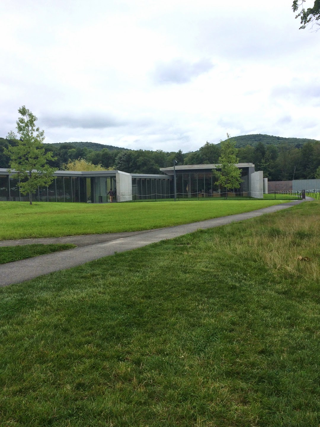
| Curving road on the beautiful grounds of the Clark |
The museum addition (by Tadao Ando), gallery renovation (by Selldorf Architects) and landscaping (by Reed Hilderbrand) have been described much better by others, namely Roberta Smith in the New York Times, Sebastian Smee in the Boston Globe, and Lee Rosenbaum in the Wall Street Journal. Mostly, reviewers rave about the changes and improvements, but there's always one (or more) in the crowd who doesn't like change.
 |
| The original museum building, as iPhoned Friday. |
I found the story of the original Clark, established by Robert Sterling Clark and his wife Francine, a fascinating one: Sterling Clark had piles of money inherited from the Singer Sewing Machine Company, became an adventurer and world traveler who shocked his conservative family by marrying a French actress. The couple's devotion to art collecting and desire to preserve their collection for the future led to their building the Clark and opening it to the public in 1955. What's not to like?
So, just to let you know that this is just my relation of our road trip and my personal take on the Clark. If you want more, check the links.
The New Building and Layout


I'm showing you these three views because I'm not really sure which one leads to the correct entrance. We went in the wrong door, didn't see an admission desk and were inside for free and walking around the galleries in the original building. Apparently if you take a left instead of a right in the concourse between buildings, you are IN.
 |
| This is the concourse. To the left is the original building with American and European galleries. To the right is the new building with special exhibitions. The plastic "bricks" on the wall honor donors. |
 |
| The original cornerstone dedication. |


 |
| The painting here was only postcard size but it contained incredible detail (Lucio Rossi, 1875). |
Above are views of some of the European galleries in the original building. They have been revamped to have a cleaner and more spacious feeling. I did notice the difference from earlier visits. And the good thing about the redesign is that you can whiz right through these to get to what you really want to see.


Yes, it's all about the Ladies Room and this one was a real beauty - all that marble tile and beautiful soft light. It was just crying out for a selfie.
Apprehended and Shaken Down
Right after we emerged from the Ladies Room, we went up to a guard to ask where the Abstract Expressionist show was and of course he noticed that we weren't wearing the fluorescent orange wristbands that show you've coughed up your $20.

 |
| Passing quickly through the gift shop, we descended the stairs in the new building to pass through the restaurant and find the Ab-Ex show. |

 |
| Before descending, however, we took note of the wonderful views through the expansive glass walls. |
Make It New: Abstract Painting From The National Gallery of Art, 1950-1975
Before showing you my amateur iPhone pictures, I recommend that for professional views you take a look at some links: the Clark's Facebook images of the show and also a review by Cate McQuaid in the Boston Globe with beautiful pictures.
 |
| Cy Twombly in the lobby area, Untitled (Bolsena) from 1969. |
I don't want to be a tease, but this post is so long that I'm going to make a Part II with photos of some paintings and my observations. I like posting big images on this blog, but they do take up a lot of space and take some time to load. Plus I have to go watch the Netflix series that I'm bingeing on. First things first.
It is very beautiful. But to me it felt a little Disney-fied. I really missed the old entrance with all the books! Apparently they are now part of the library in the old building but it wasn't open when we were there. I just feel that the new entrance obscures the art. I wondered how many people never even made it up to the actual museum. They seemed too busy lounging by the pool with their cell phones. I don't know. Call me old fashioned. I do love the gallery up on the hill though. That is my favorite part of the museum. Glad you had a chance to go out there.
ReplyDeleteThank you for commenting, Roberta! If you read Part 2 of my post, you will see at the end that I come to conclusion that it's kind of hard and cold. Sorry that I never got up the hill to the gallery there. Guess I'll have to save that for the next time, but I don't think I'll be rushing back.
Delete